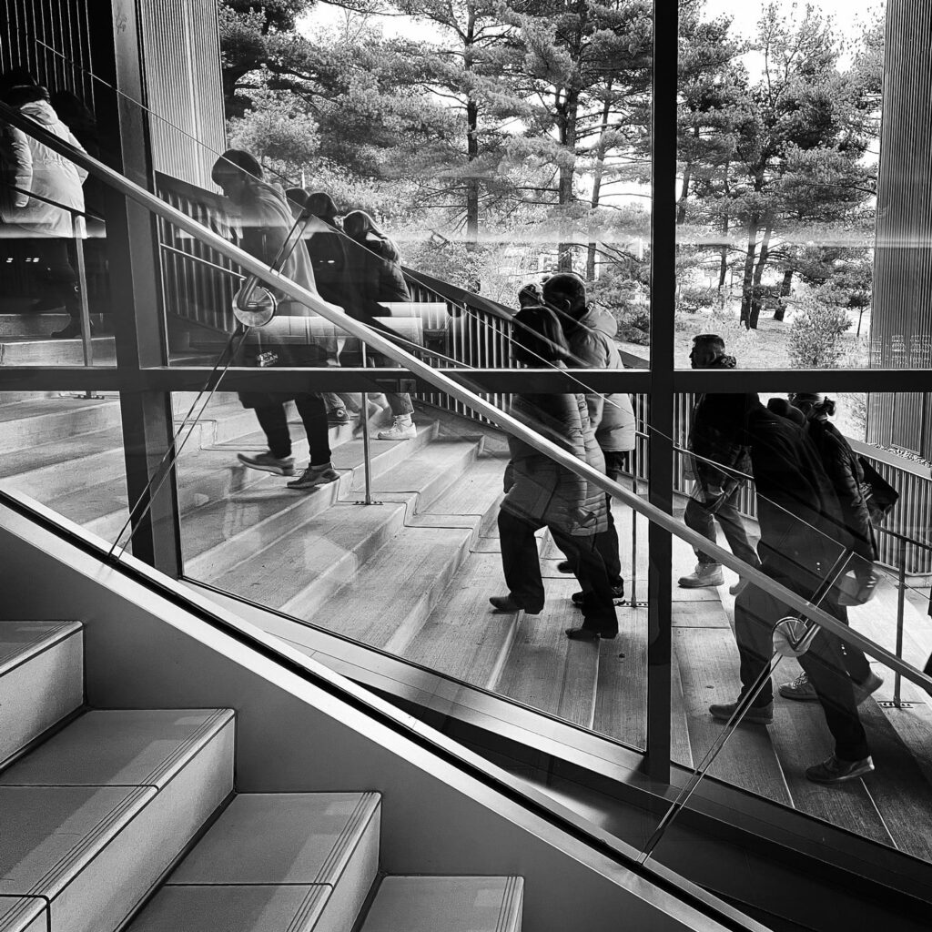
I love visiting colleges. Their design can be so beautiful and weird all in one package. Like a time capsule with competing parts added who knows when. I found these stairs visually difficult to navigate given “the mirror” image presented outside. One set is an interior stairway to a dining center, the other is an outdoor bypass stairway at a different angle and tread depth. It’s fascinating how very subtle visual disruptions can be inadvertently added that can subtract from an experience. I wonder if I would have noticed if the stairs had been more similar?
